The client
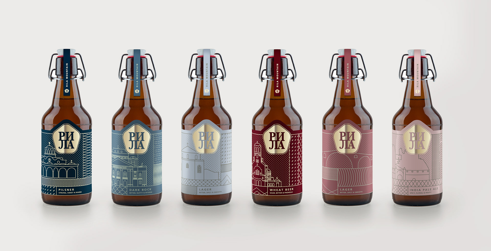
Rila Mountain is a craft refreshments company producing Craft Ale and Lagers, Cider, and Craft Distilled Spirits.
The brief
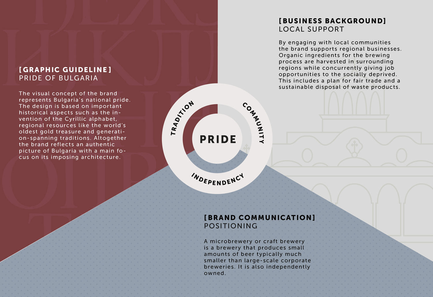
The brief for this project was to formulate a ‘strong Bulgarian’ brand among the many imported products to encourage Bulgarians to appreciate a high quality local product.
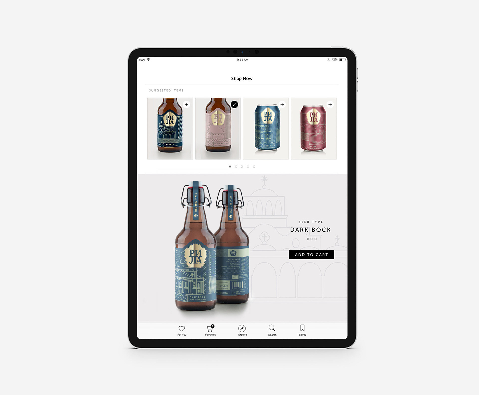
The concept
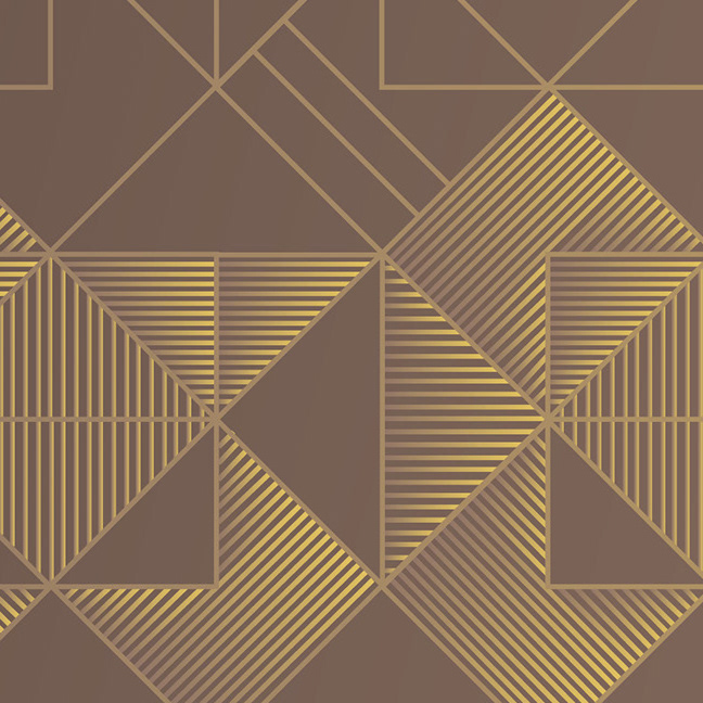
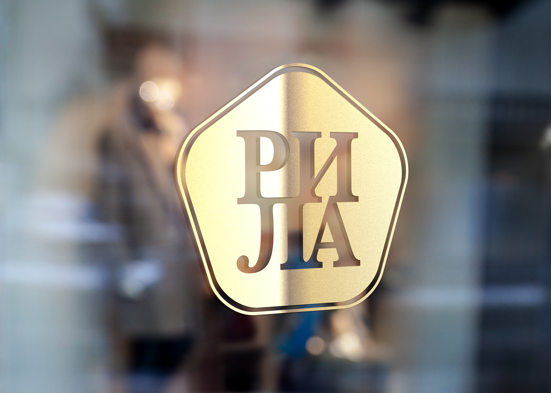
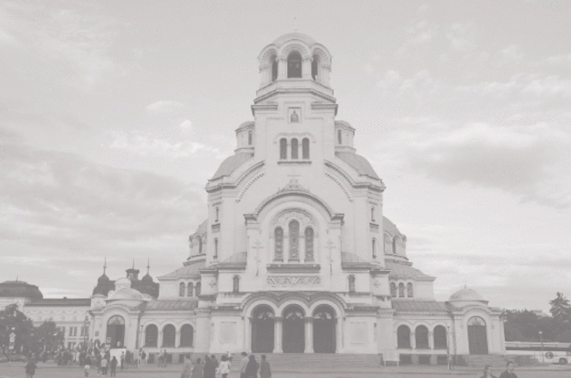
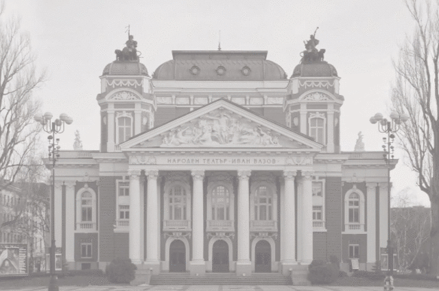
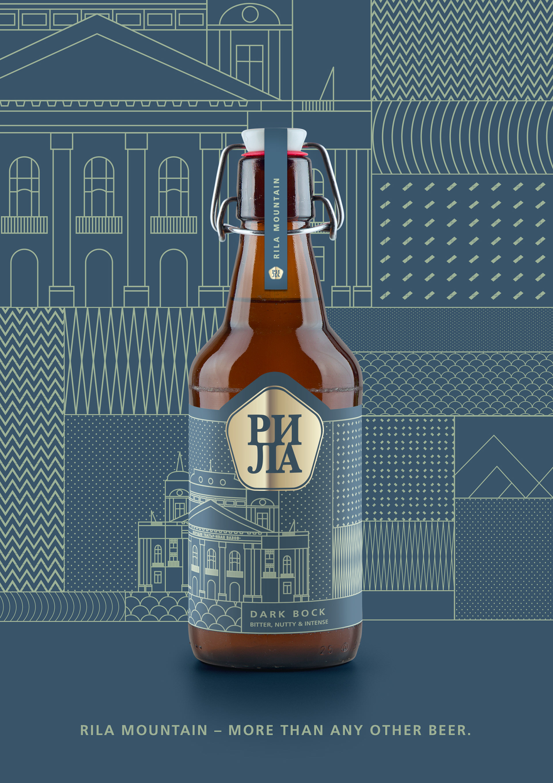
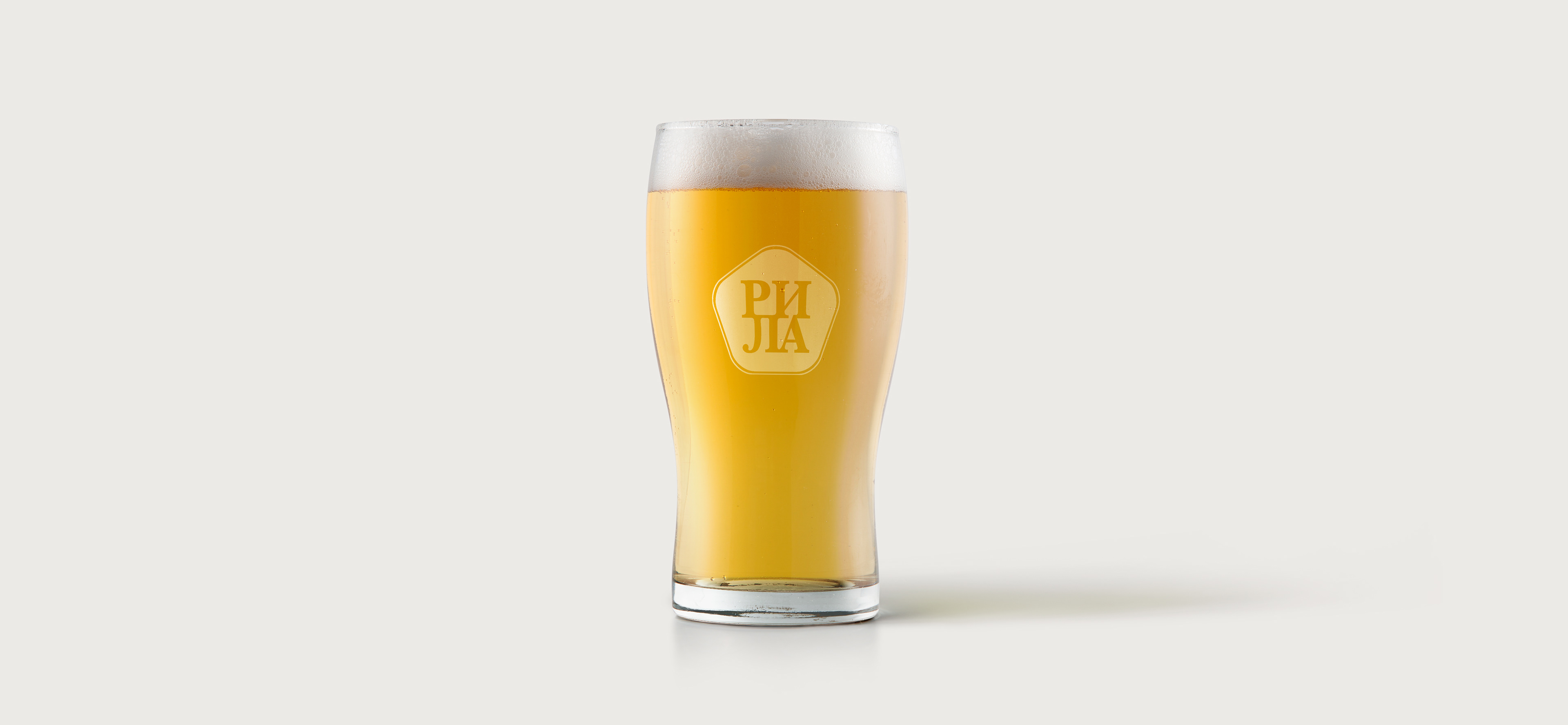
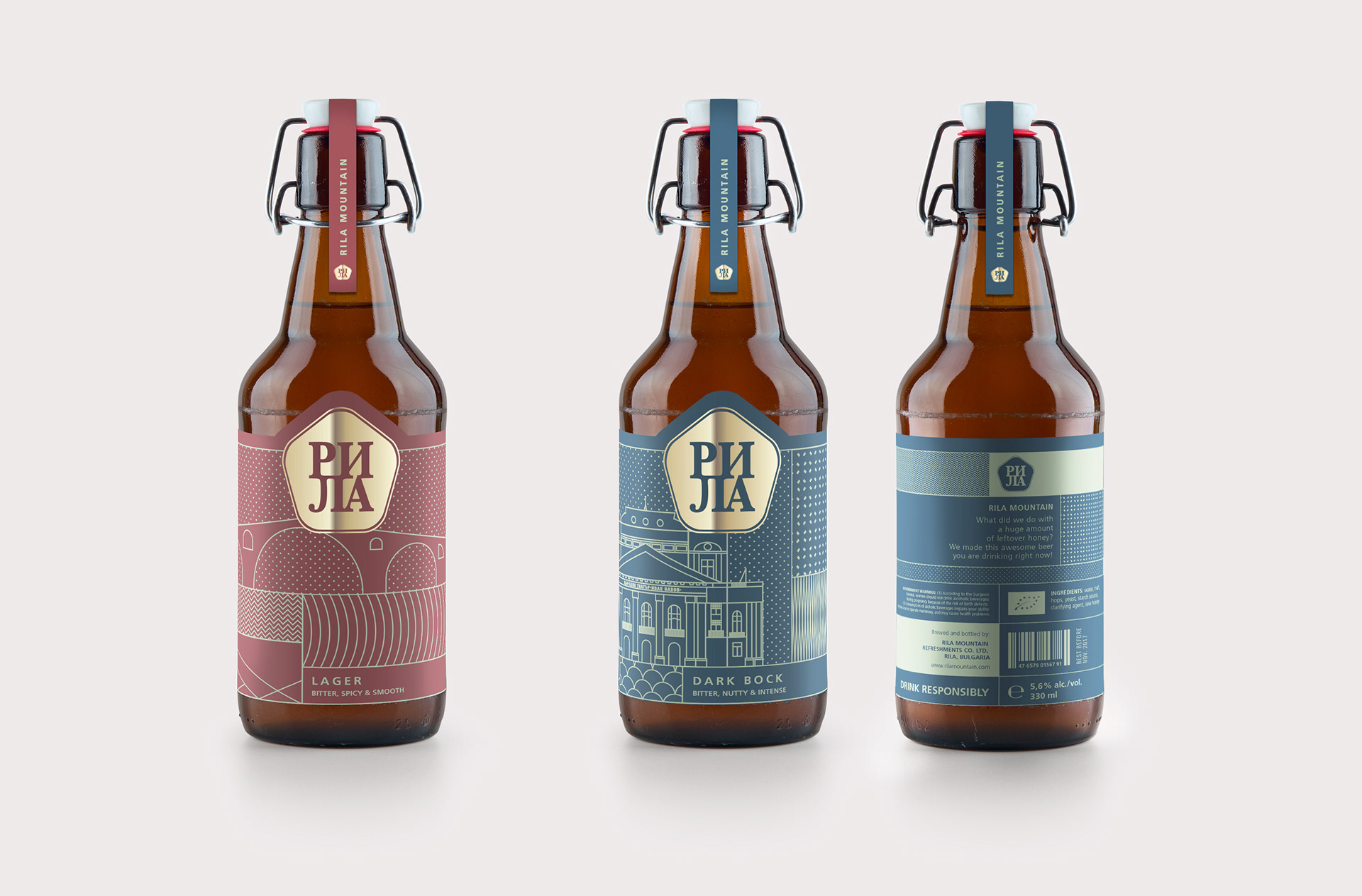
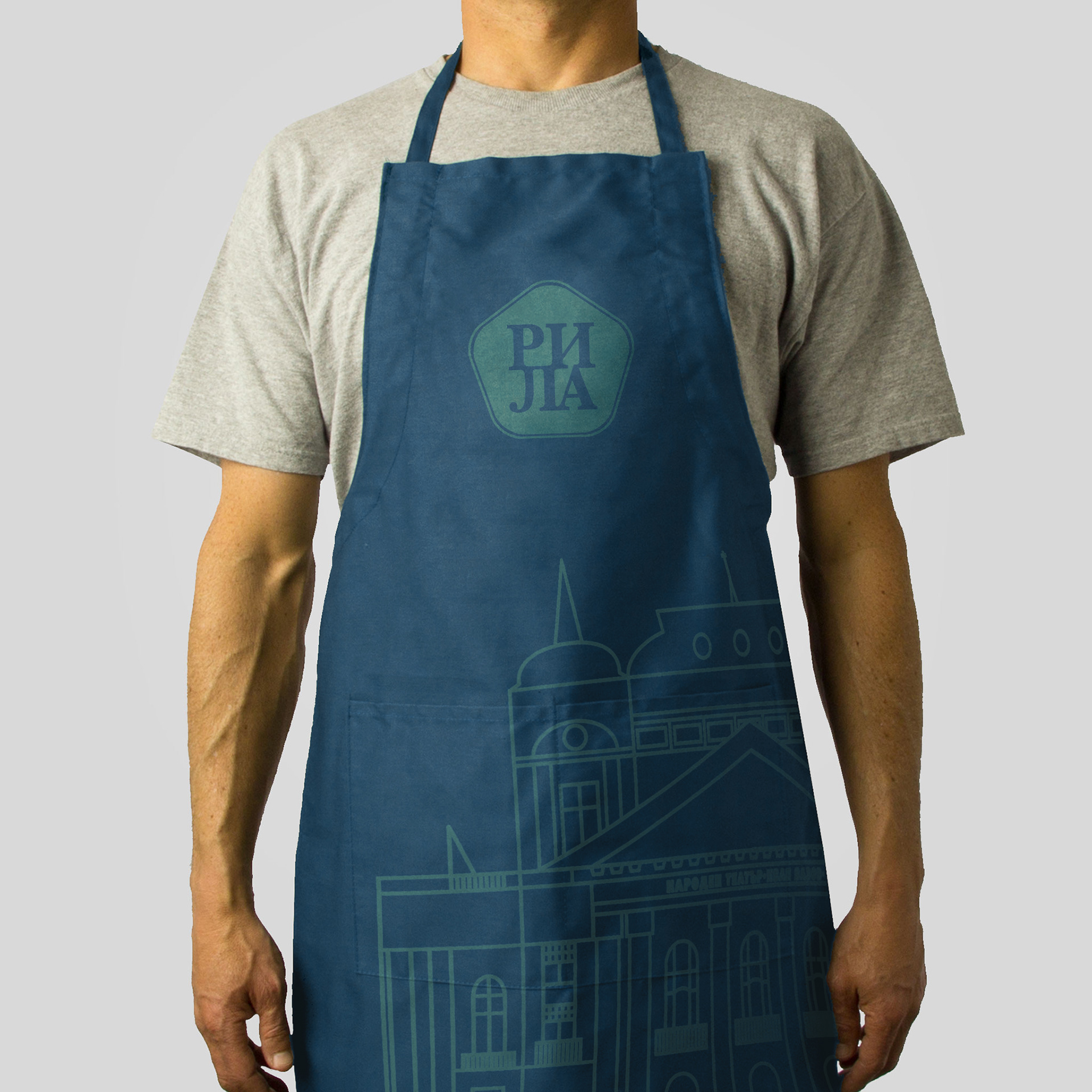
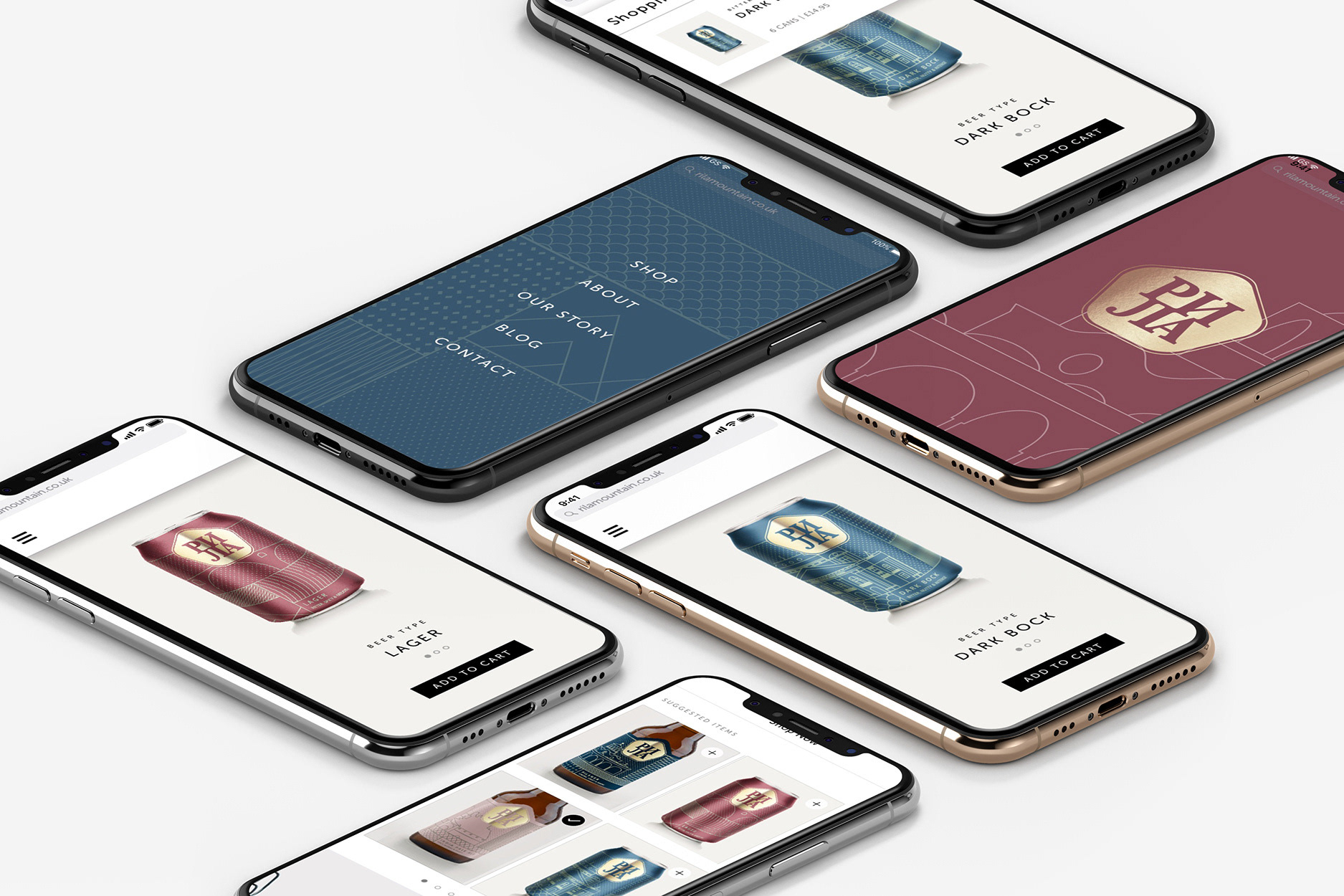
The concept is based on craftsmanship, social engagement and cultural belonging. To illustrate the national pride of Bulgaria the labels shows famous sights in Bulgaria, such as the Rila Monastery, the Alexander Nevsky Cathedral, the Belogardchik Fortress, and many more. The colours are taken from the frescoes within the monastery on Rila Mountain, where the beer is made, and serve to distinguish the range of products between lagers and ales. The logotype is based on the Cyrillic alphabet, as it was originally established in Bulgaria, of which the people are very proud.
The pitch
This was a collaborative 'real client' project made during my MA at University of the Arts London.
Our course of 54 students split up into 9 teams each of around 6 students to pitch Rila Mountain’s new visual identity to the client. Our group concept and visuals convinced the client the most and was the winner of the pitch.
Our course of 54 students split up into 9 teams each of around 6 students to pitch Rila Mountain’s new visual identity to the client. Our group concept and visuals convinced the client the most and was the winner of the pitch.

Made in collaboration with my amazing team:
Alessandro de Rosa, Marilia Rojas, Theresa Hartlieb, Verena Bublak, and Joy Schlink