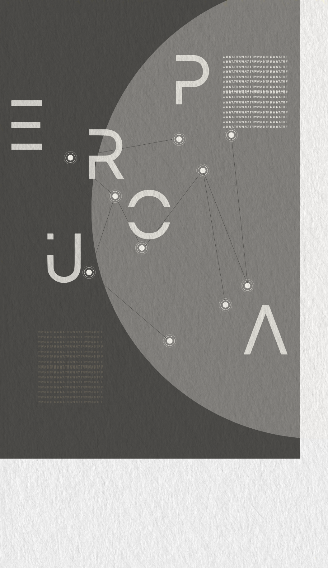
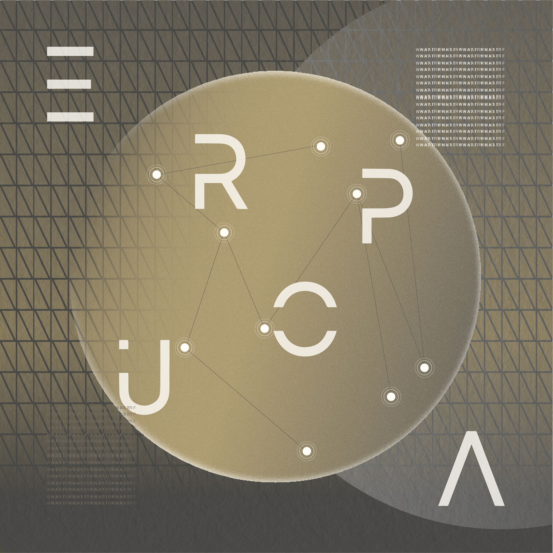
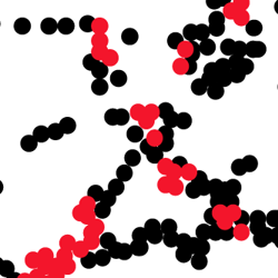
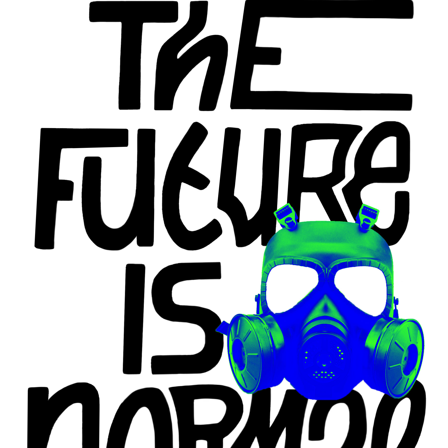
Back in November, I was messing around with some logo design in Illustrator, as you do on a Sunday night. In the background my radio was tuned in to a docu about an ocean on Europa, a moon of Jupiter (Radio Doc: Oceaan in de ruimte). This ocean could indicate the possibility of life, and NASA will be sending a spacecraft to Europa to investigate this in more detail in a few years (supercool, nerdingout etc). Because of the topic and and the very Sci-Fi-esque music, I subliminally made something that looked like the above, which unfortunately was incredibly irrelevant to the actual logo work that I had planned on doing, so I put it aside.
The visual has been on my mind ever since, maybe because I’ve never felt further from the good old ‘EU’ since the 1st of January and I wouldn’t mind getting on a spacecraft right about now, or because it’s kind of ironic we’re sending extremely expensive spacecrafts to look for possible life on Europa, whilst so many lives are being lost trying to reach the Terran version?
Ahh anyway, moral of the story: Listen to the radio more, kids!
